
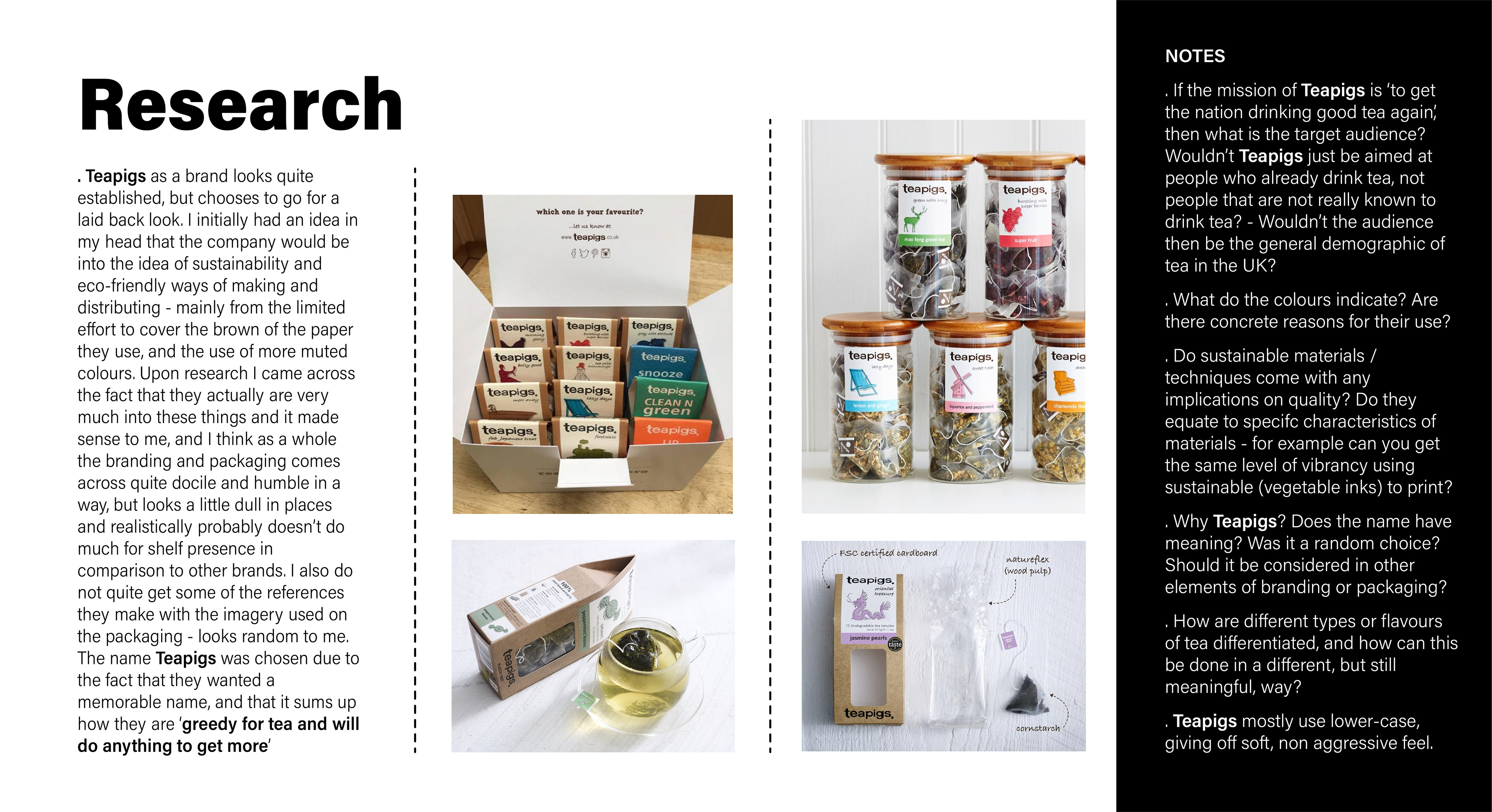
For this project, research into the brand itself was key. Teapigs is not a fictional company; it is a brand that has values, morals and an identity to take into account. No decisions made for the project were done without referring back to the research. The project in question wasn't necessarily an entire rebrand, but just took a different direction to what the company had been going down already. I took the path of a bolder look, aimed at a younger audience, and kept the sustainable feel that had been present prior.

Deliverable 1 for the project was to design and craft a final outcome for the product. To display how my
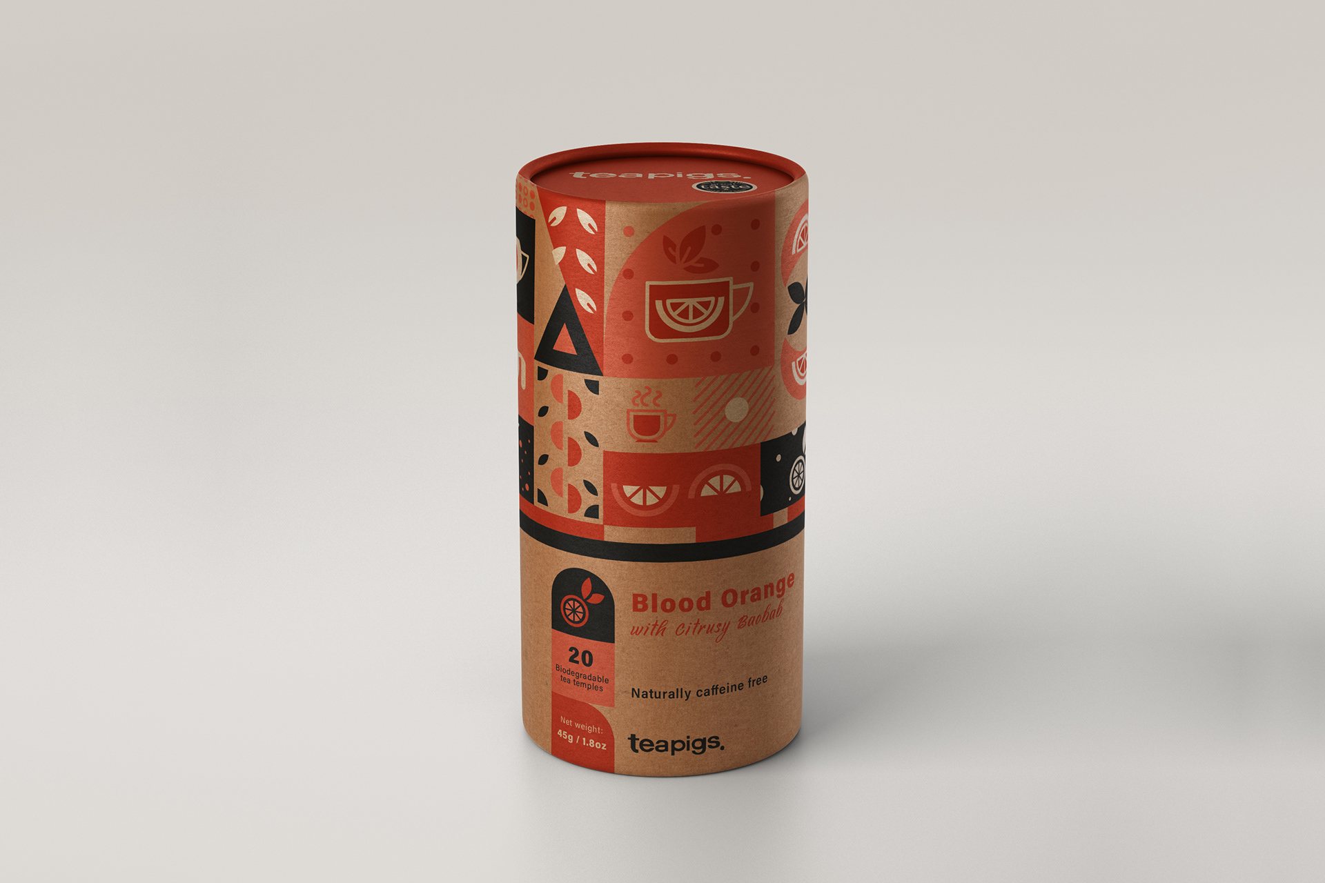
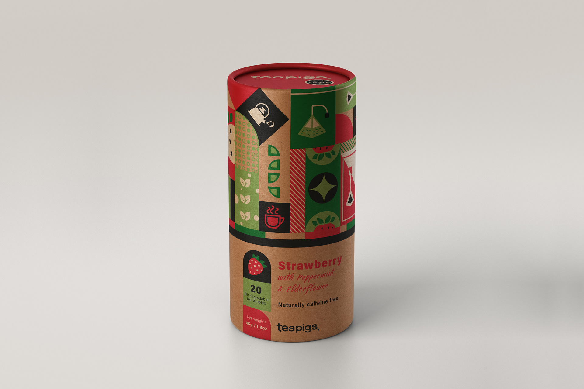
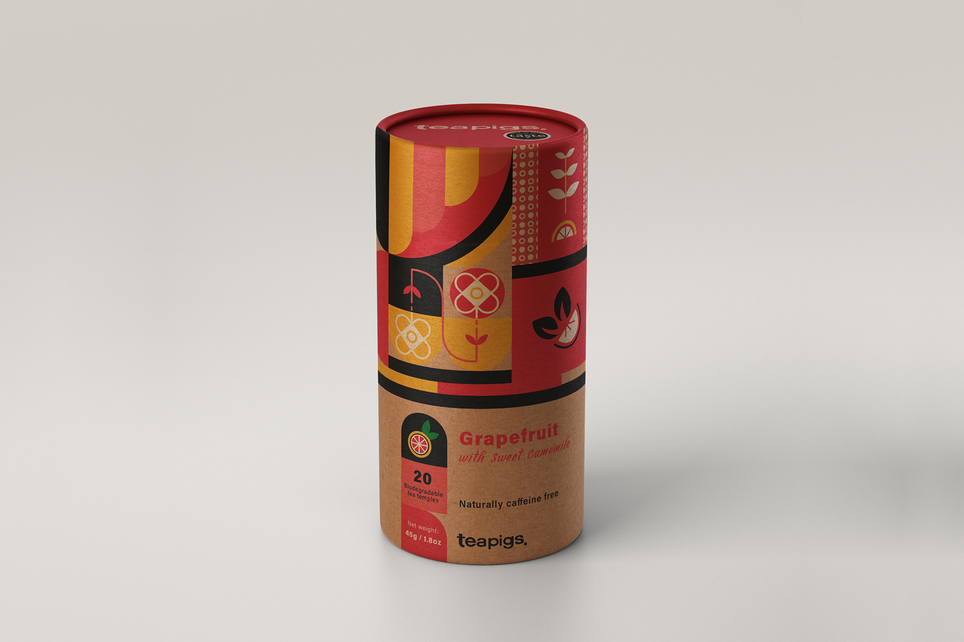
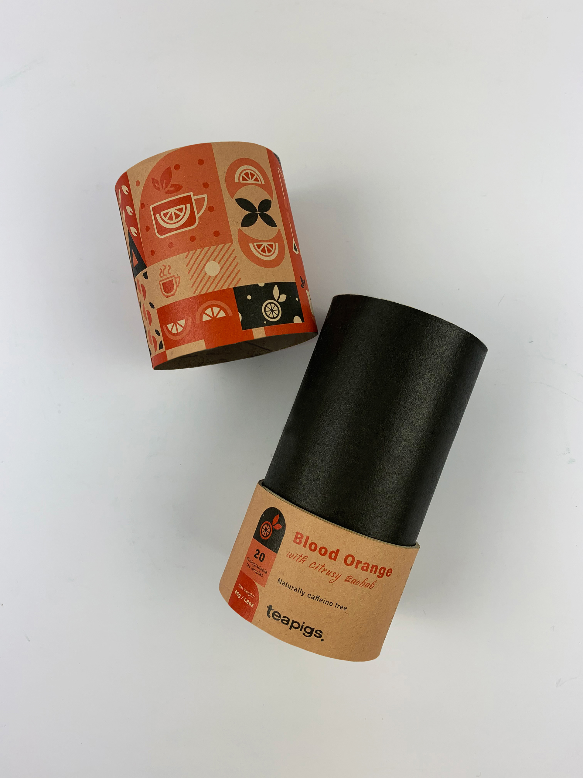
designs could work as a series, I ensured that I show that the product could actually be viable in multiple flavours. Blood orange with Citrusy Boabab was the product that I ended up making by hand, but I also have 2 examples of flavours outside of this.
designs could work as a series, I ensured that I show that the product could actually be viable in multiple flavours. Blood orange with Citrusy Boabab was the product that I ended up making by hand, but I also have 2 examples of flavours outside of this.
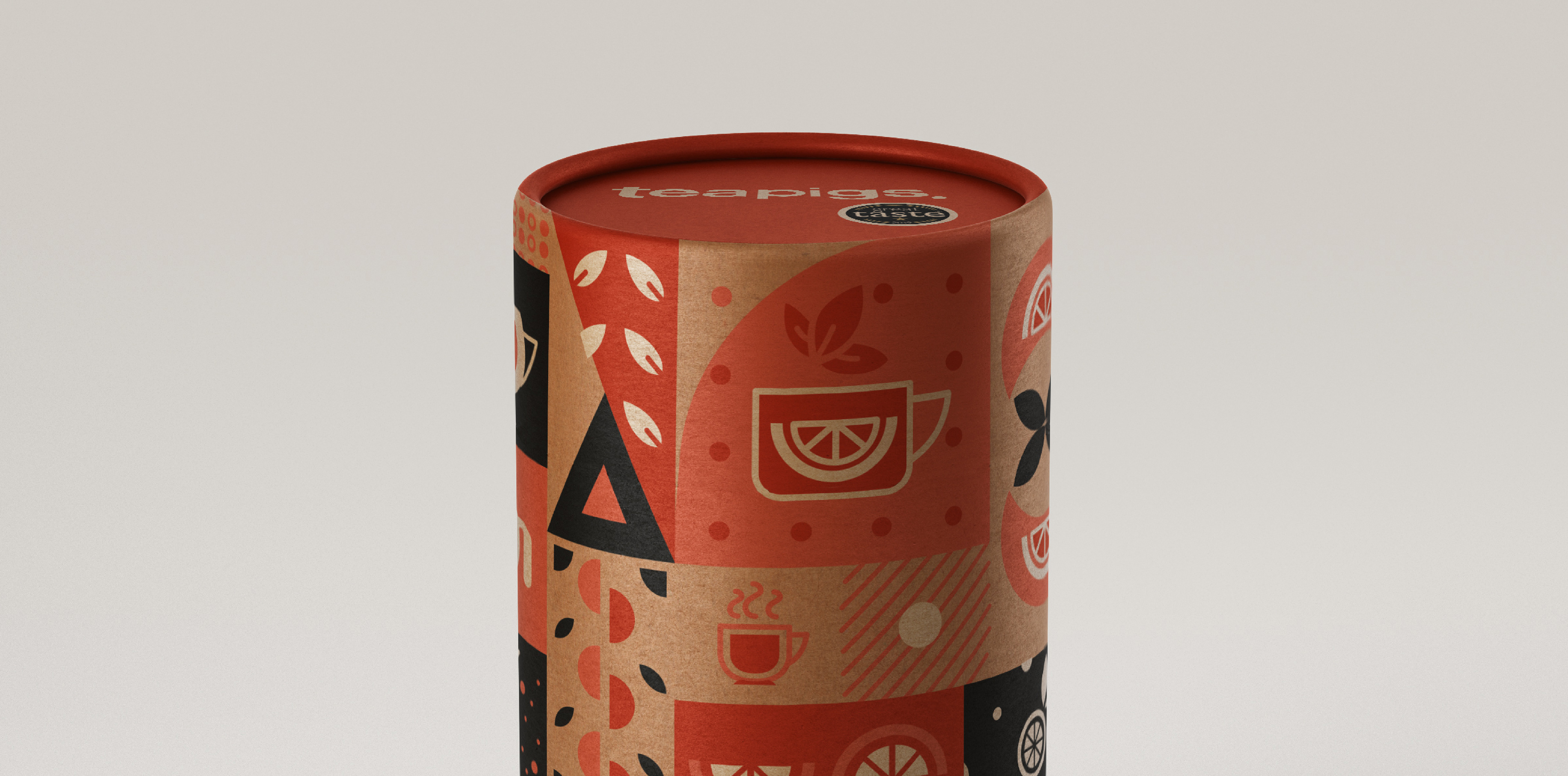
The main idea behind the concept was bring in all of the elements of Teapigs that I thought would be best appropriate for the brand; the idea of fun and bold, sustainable, and high quality produce, are key aspects that I focused much of my design direction on. I wanted the design to be bold and fun, which is carried through via the mix of bold block colours and large icons that related to the specific flavour. The fact the packaging sits in a tube also shows a bold breaking of convention as most tea products are found to be sold in boxes. I wanted the packaging in general to look and feel sustainable, which is achieved by the card of the tube showing through as opposed to having a coloured background. The third consideration was making the whole thing look high quality, matching Teapigs' reputation for putting value back into good quality tea. This last point was ensured by making the iconographic features as dynamic and well balanced as possible, and also by refining the structure of the packaging as a whole.
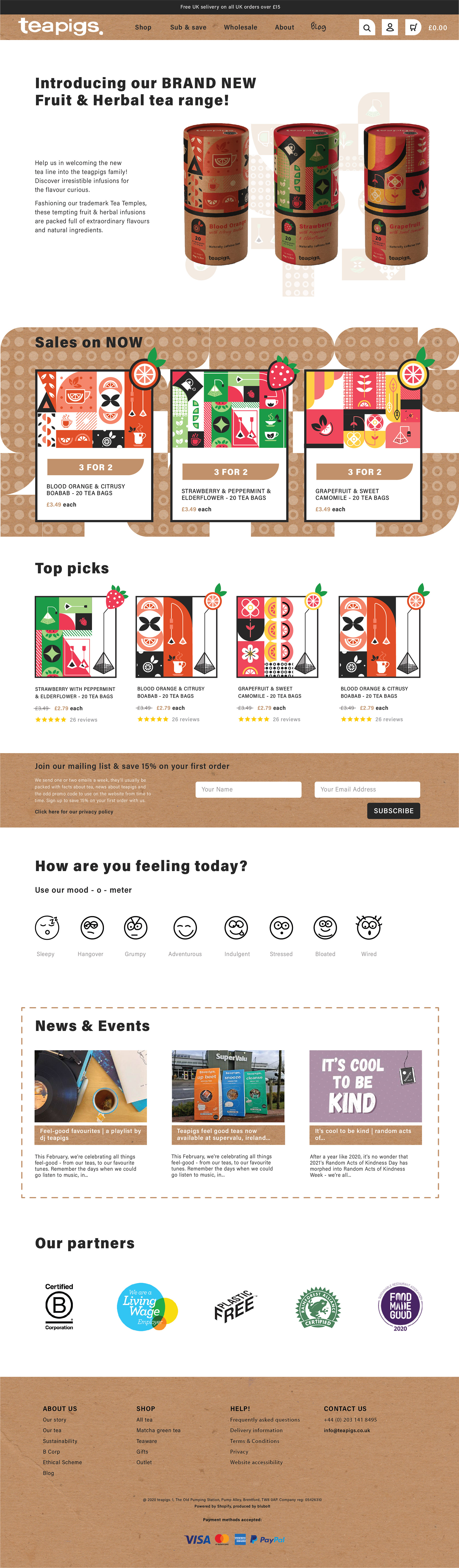
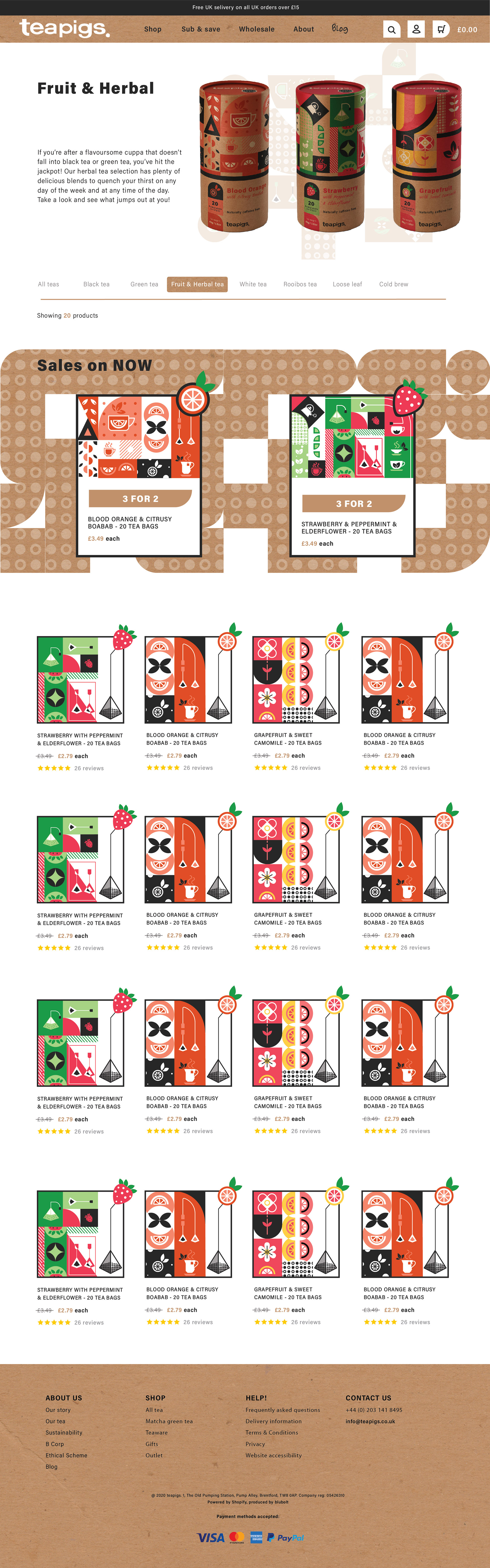
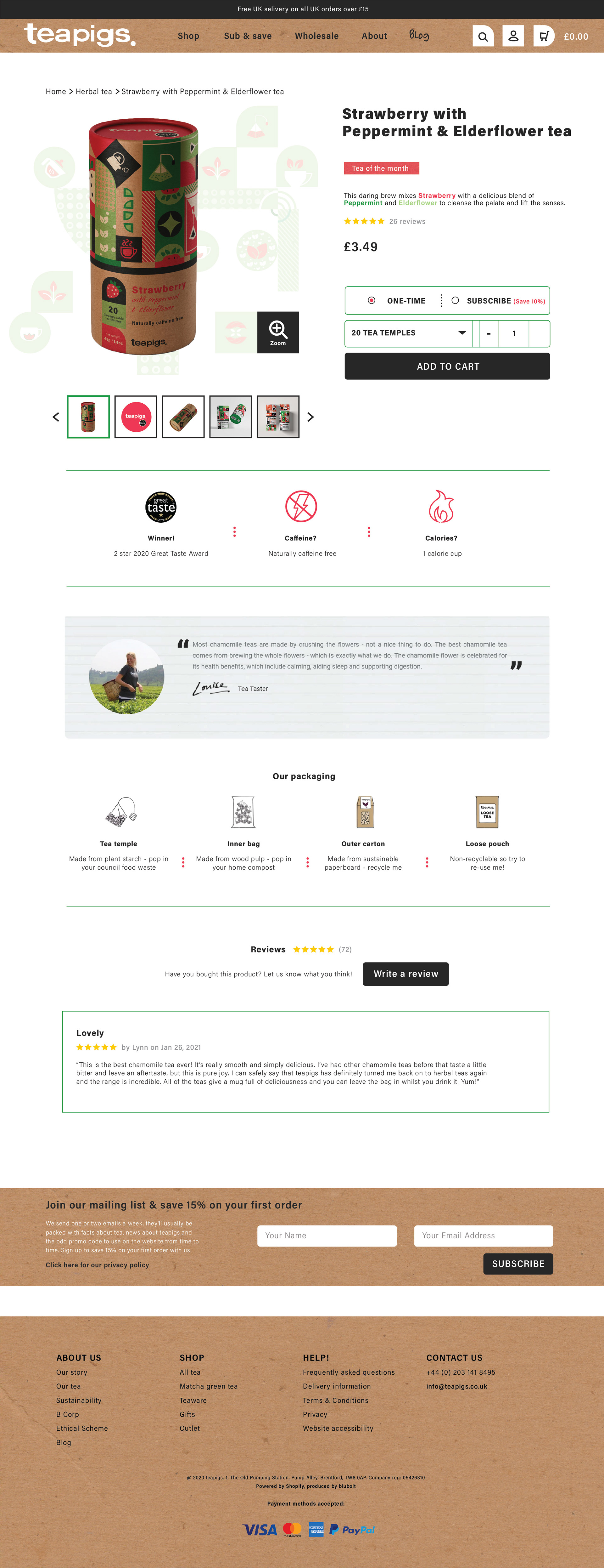
Deliverable 2 of the project revolved around displaying your packaging on an online platform such as a website, and held the responsibility of showing how the design can work on screen and at different sizes. My solution to this was to redesign three main pages of the site to show how my visual direction looks in application. Within the design I employed the use of cardboard textures, the use of iconographic elements present on the packaging, and a use of bolder colours and typefaces. The use of the sans-serif typeface 'Acumin' also adds to the modern feel that was not as prevalent in the original. Through the redesigning of the Home page, the Item listing page and the individual Product page, I sought out to make a bolder looking website that shows professionality and a concern for sustainability.
Deliverable 3 was all about displaying how the brand we created could be translated into further products or designs. I decided to make a Selections gift bag that would hold multiple products; all of which would display how the brand direction could be adapted outside of the main products. In my selection, aside from the three selected flavours of the fruits & herbal tea, I included coasters, a neutral tea caddie that would promote re-use, and a
re-usable tote bag that serves as a bag-for-life. In doing so I made sure all of the key elements of the brand
were kept consistent throughout.
re-usable tote bag that serves as a bag-for-life. In doing so I made sure all of the key elements of the brand
were kept consistent throughout.
Looking at all of which I have produced for each deliverable, I conclude that I have captured the brand in a
logical and concise way. I believe that all designs keep true to the feel I wanted to put forth, and I am proud
with the outcome being something that is bold, of high quality, modern feeling, and induces a sense of care
for sustainability.
logical and concise way. I believe that all designs keep true to the feel I wanted to put forth, and I am proud
with the outcome being something that is bold, of high quality, modern feeling, and induces a sense of care
for sustainability.
