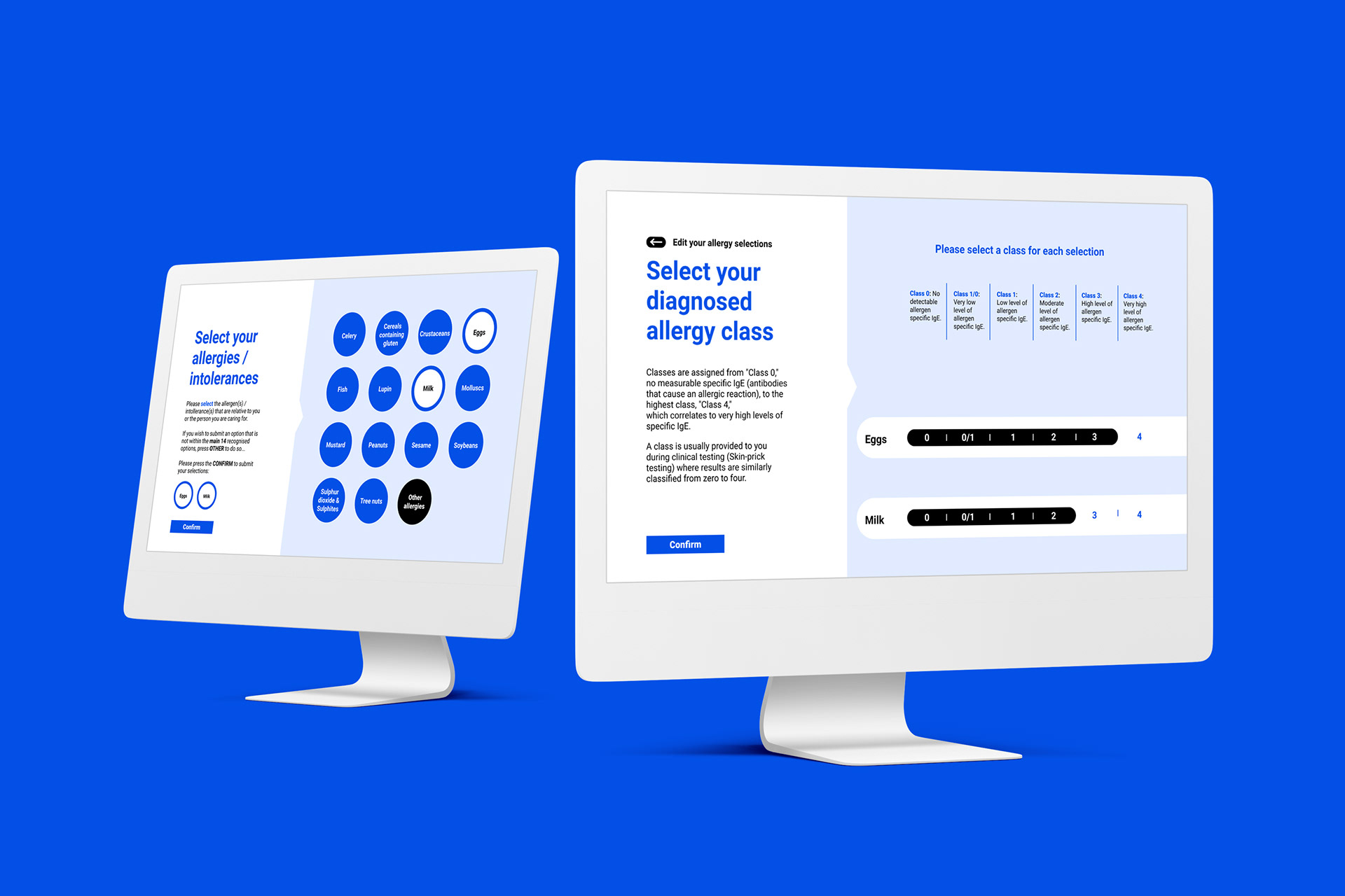
Proactiv is a mobile and desktop designed website that provides a range of information to help people who live with allergies or intolerances. With this project we were given the opportunity to base it on anything to do with health. I decided that allergies and intolerances would be an interesting avenue to go down. In the site's creation, the main drive was in my belief that education is what bridges the gap between fear and control in a person’s life, and aimed to arm people with information needed to navigate their lives with less worry.
The site's services extend to; informing on a variety of allergies / intolerances, keeping up to date with articles
and studies, providing information on alternative products, and giving opportunities to reduce or completely rid of an allergy / intolerance. It is also important to know that you do not need to have an allergy or intolerance to use Proactiv. These services are welcome to anyone who is willing to even just educate themselves on the topic.
It may be doing so for a friend or family member. Whatever the reason, all are welcome.

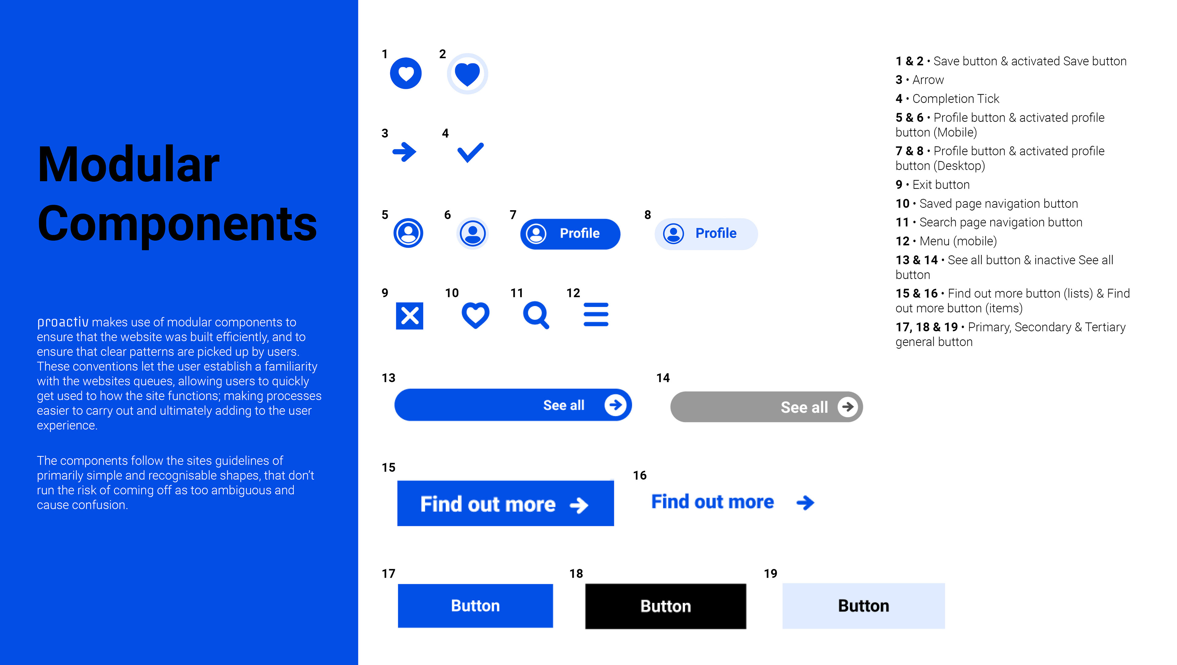
Users are of the utmost importance throughout the entire process of UX/UI design. The users are involved at the start of the project, the middle of the project, the end of the project, and after the project is completed also. Each design decision in this project was made with user research in min
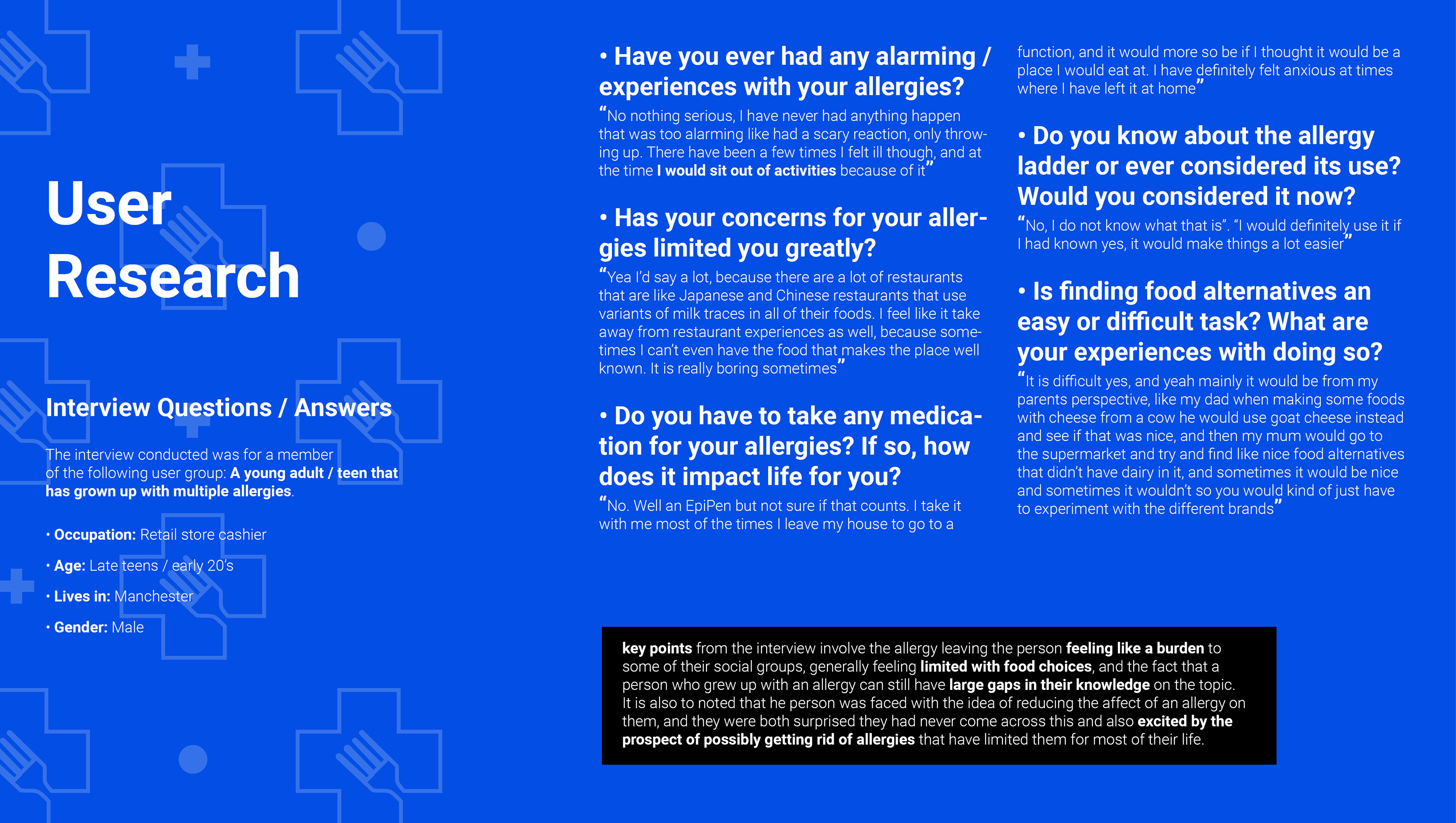
We started off with an interviews with potential users, followed this with the creation of user personas and groups that encompass a variety of needs and pain points, moved on to user journeys and sitemaps based from the personas, and eventually we tested our prototypes with actual potential users also. All of this built up an arsenal of invaluable research of which was referred back to constantly in the site's development.
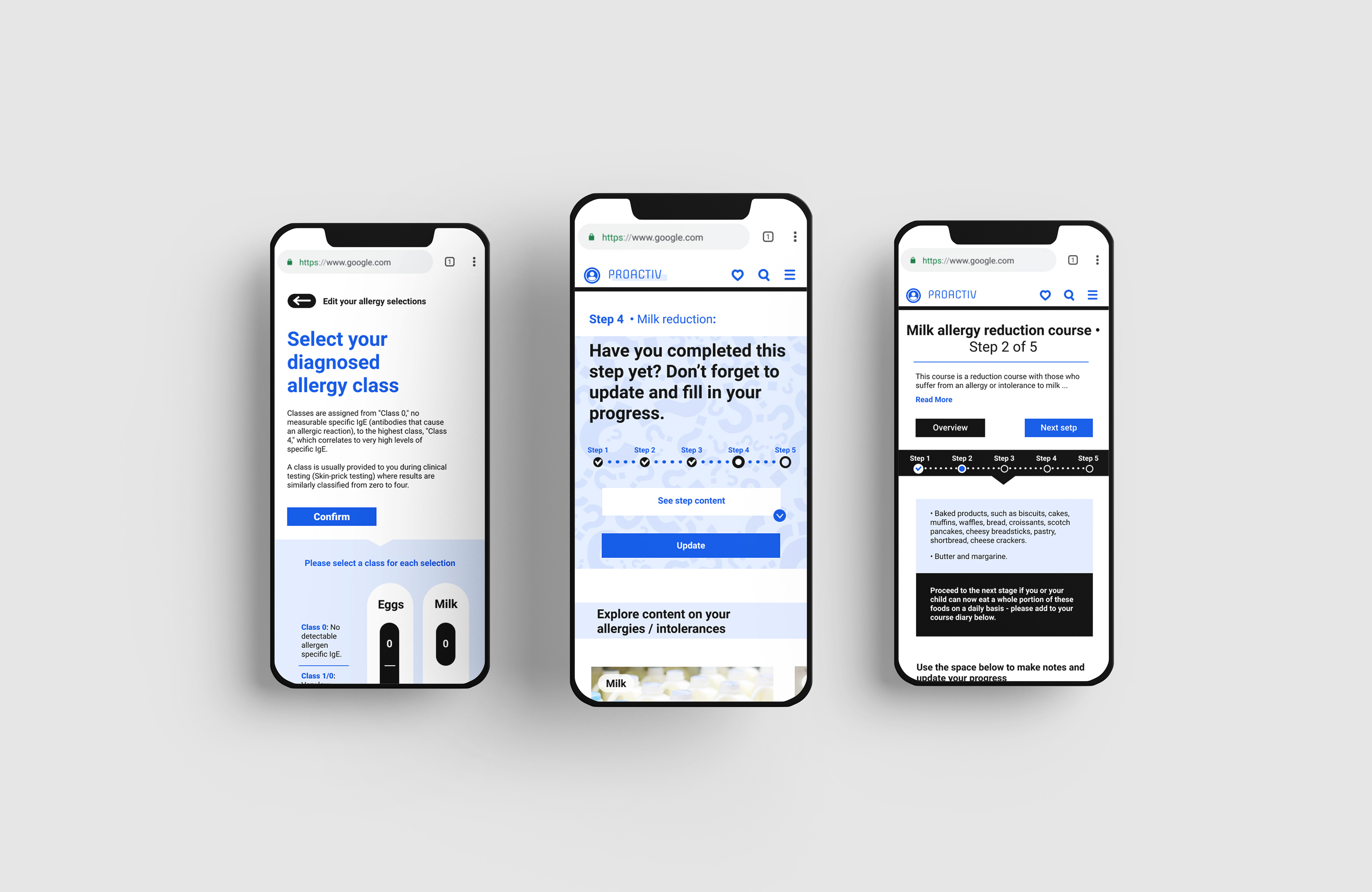
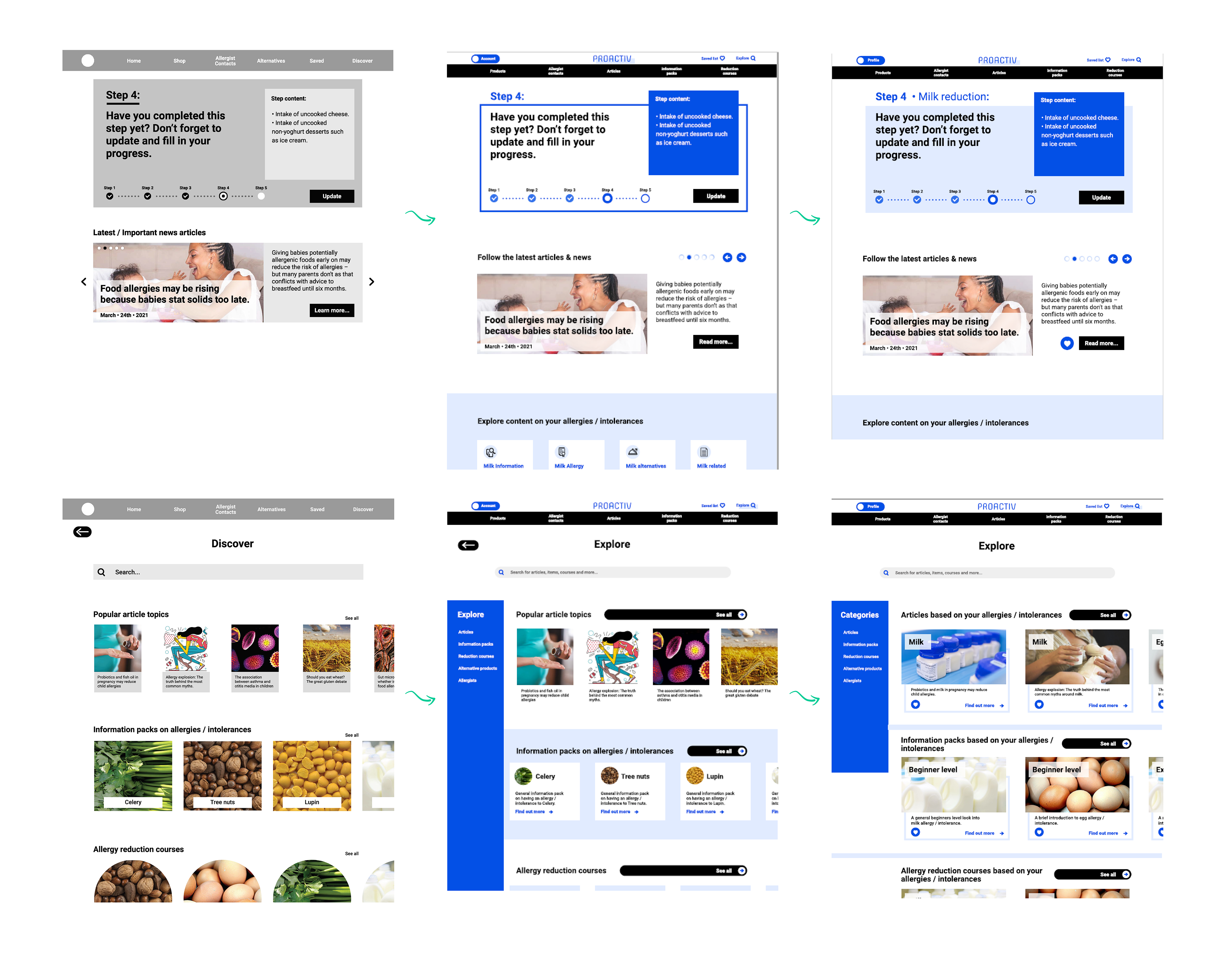
User testing allows for a new perspective on the site and how it actually works as a functional prototype. More importantly, this new perspective is that of an actual users; giving direct feedback on their experience on the site.
From this I could effectively gauge where certain aspects would have to be reconsidered and where aspects actually do work in favour of making an experience for the user that makes sense. At this stage developments were made on the back of feedback given from the testing, allowing me to make amendments where it felt necessary for the user.
From this I could effectively gauge where certain aspects would have to be reconsidered and where aspects actually do work in favour of making an experience for the user that makes sense. At this stage developments were made on the back of feedback given from the testing, allowing me to make amendments where it felt necessary for the user.
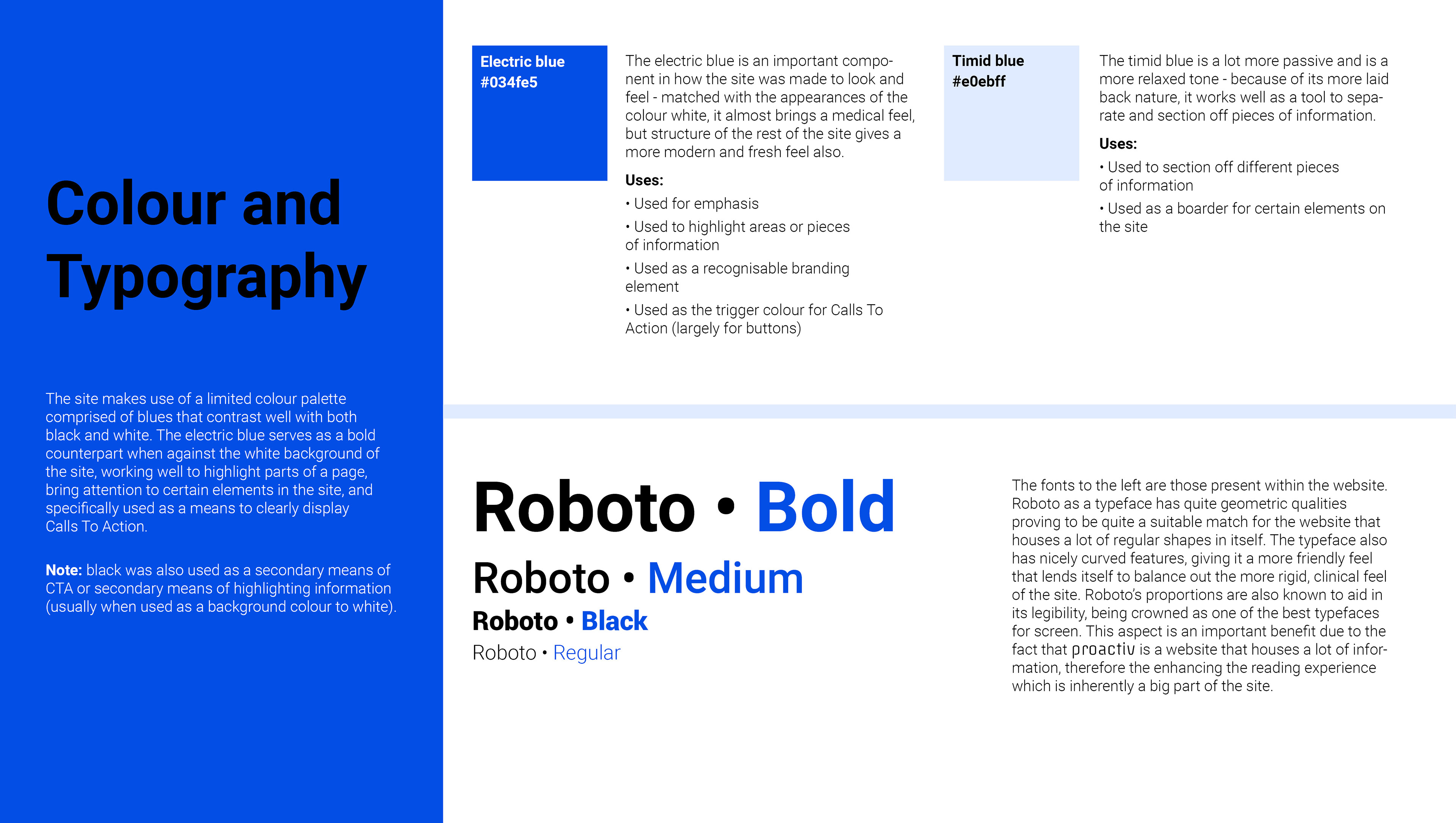
The design of Proactiv follows a cleanly structured system made up of a thoroughly considered mix of minimal colours and simple shapes - the bold contrast of the blue on white that shines throughout the site has a subtle medical aesthetic but with a fresh, sophisticated feel.
The site makes use of a limited colour palette comprised of blues that contrast well with both black and white.
The electric blue serves as a bold counterpart when against the white background of the site, working well to highlight parts of a page, bring attention to certain elements in the site, and specifically used as a means to
clearly display Calls To Action.
The electric blue serves as a bold counterpart when against the white background of the site, working well to highlight parts of a page, bring attention to certain elements in the site, and specifically used as a means to
clearly display Calls To Action.