This branding / editorial project felt particularly large scale and intimidating. The nature of the project was unlike many of the projects we had done prior, but was a great learning experience for many of us I feel. The task at hand was to create both a property brochure and a pitch document for a new set of flats around south east London, near Canary wharf. The set of flats were given the name Merchant Quarter Considerations had to be made surrounding the possible residence as well as the corporate investors that would possibly take the property proposal on. Research was key in not only understanding the conventions of marketing properties in that area,
but also understanding how to push the idea to estate agents or other types of corporate entities; all as well
with consideration for how these documents would be constructed as a physical editorial piece.
but also understanding how to push the idea to estate agents or other types of corporate entities; all as well
with consideration for how these documents would be constructed as a physical editorial piece.
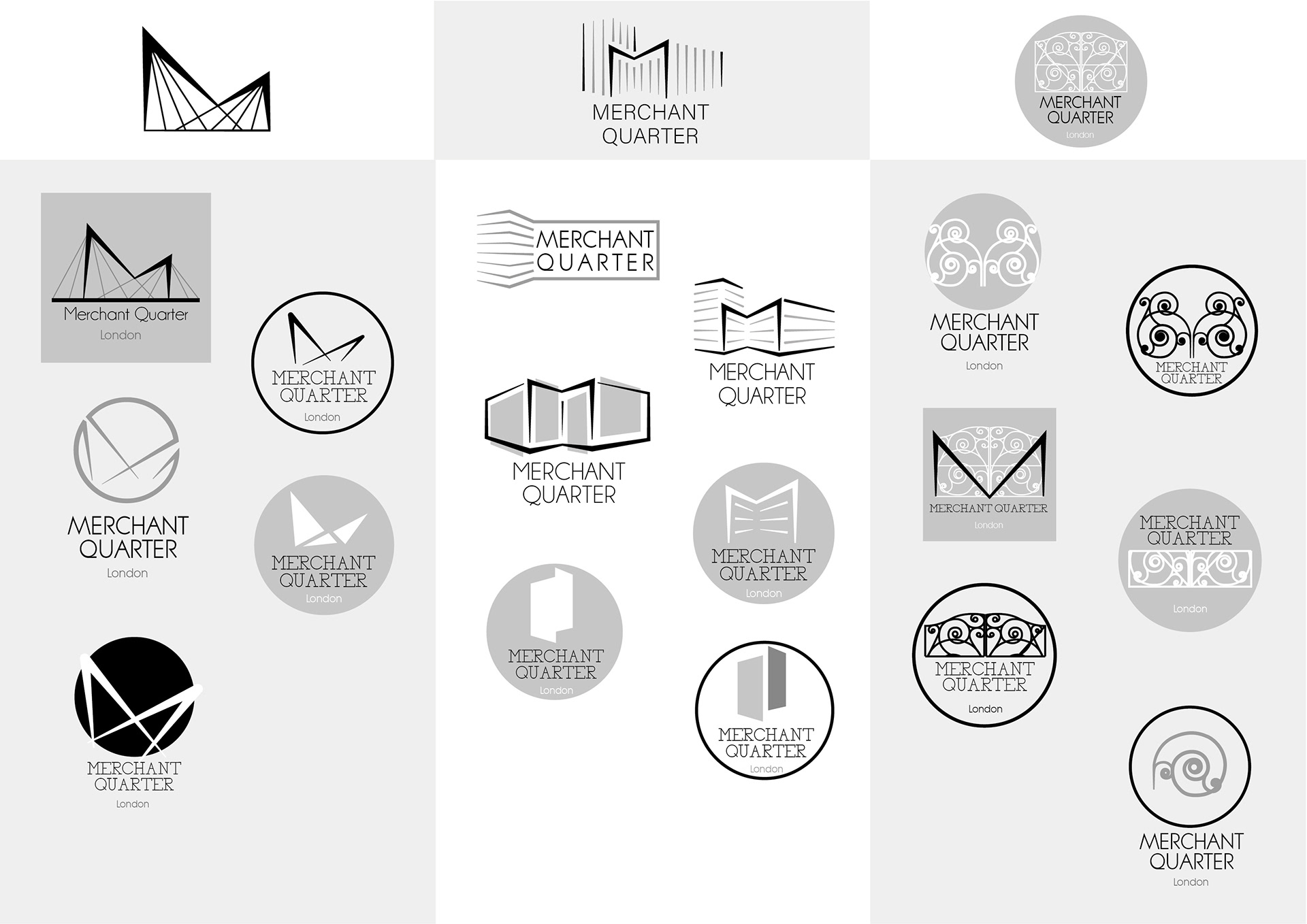
The logo was the starting point in relation to how the design identity would be formed from the research. Some variations were fuelled by the quite rigid shape of the building, others were very general to what you may see with many other modern properties. They were OK solutions, however they were not at all unique or personal to the Merchant Quarter, nor to the area that it is located in.
The above iterations displayed much more of the research that had gone into the area and into the type of property on focus. A lot of modern properties like Merchant Quarter made use of regular shapes for containers such as squares or circles for practicality. These geometric containers made for effective solutions when placing the log into different situations; allowing for surrounding elements to look more natural and less awkward.
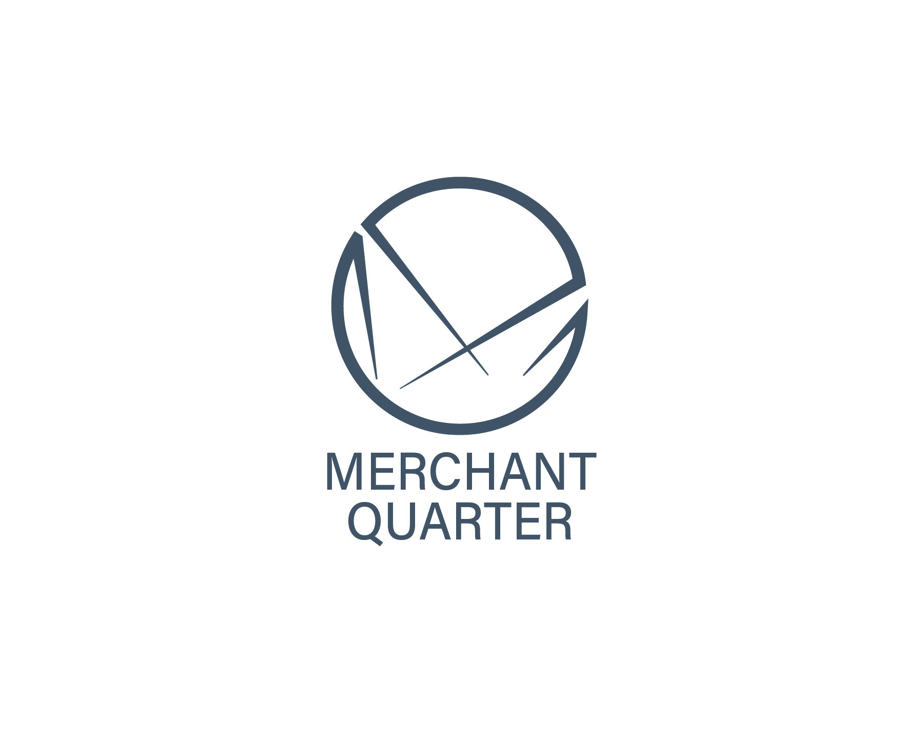
From a historical standpoint, from the selection above, the iterations on the left and the iterations on the right were held a lot of weight; they shapes were based off of pieces of architecture within the area. These two are more than just interesting icons, they reside from the story that the area E16 and Silvertown has to tell. These two became the final concepts that I felt the strongest to take the brand with.
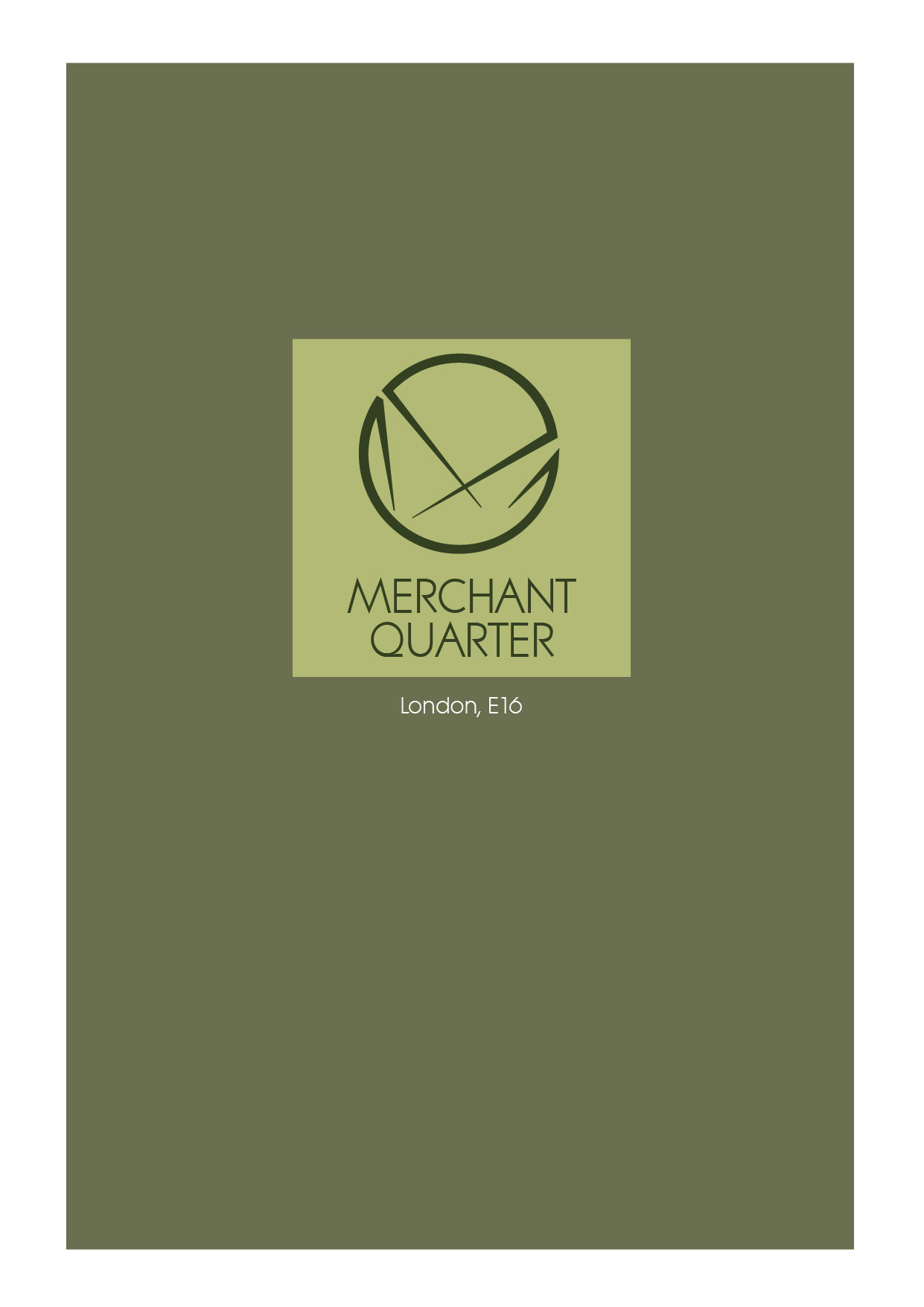


The two final concepts of the logo came down to iterations based on the culture and history of the location, adding a personal and meaningful touch to the identity.
With the logo, I did not want to stray too far from this duality of modernity and history / culture. This was carefully thought about with the design. The idea around it was based on the Docklands and inspired heavily by some structures seen on top of the building of the Excel centre. This again was to hint at the history of Silvertown and its cultural associations, but having it surrounded in a modern frame of design, is where the duality takes place and makes for an interesting logo.
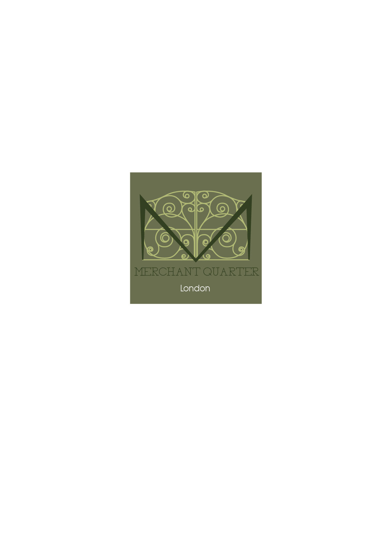
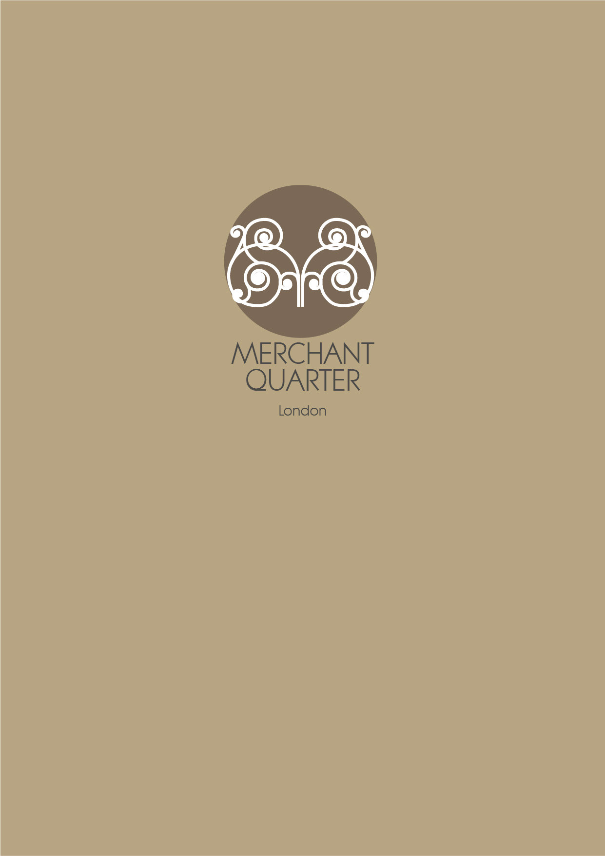
The pattern seen in some of the example above is taken from a set of blue gates that were put in place for re-development of the mill - an important piece of memento of Silvertown and it’s industrial background. We have purposely had the pattern appear not only generously throughout, but notably as one opens and closes the documents - just as a gate would upon entry or exit.
After research I understood Silvertown to be a true gem of a location that has witnessed innovation, spectacle, novelty and creativity. The history of this extraordinary place is a marvel in its own right and it makes sense for a piece of this to show through in the brand’s identity.
Why blues? Not only is this colour generally one that induces calm and welcoming feelings, visually there are
a lot of muted blues and darker greys that are related with Silvertown; if not the river Thames, the reflection of the water on the various glass buildings, the rails that allow for the connections between this side of London and the city, the machinery and buildings that are a key part of Silvertown’s past. I also recognised that the overall colour blue to show some sense of professionality and security also, in all being a solid choice for this.
a lot of muted blues and darker greys that are related with Silvertown; if not the river Thames, the reflection of the water on the various glass buildings, the rails that allow for the connections between this side of London and the city, the machinery and buildings that are a key part of Silvertown’s past. I also recognised that the overall colour blue to show some sense of professionality and security also, in all being a solid choice for this.
ACUMIN PRO - a modern and sophisticated typeface, that not only holds strong with legibility but also in itself is diverse in sizes and types, making this professional typeface viable in many situations The modern feel it brings is a typeface that pushes the idea of new beginnings and looking to the future, especially when catering to young couples looking to start families.